Last time we covered design changes in macOS on this blog was back in 2015. At that point, OS X Yosemite had just been released, featuring a major overhaul of the user interface. Following in the footsteps of iOS, Yosemite moved away from a skeuomorphic interface towards a more flat, minimalistic design. At the same time, the Tower Git client was updated to adapt the new look and feel of OS X 10.10.
Well, the time is here again! The release of macOS Big Sur is just around the corner, and with it come comprehensive visual changes to the primary elements of the operating system, including windows, menus, icons and the dock. We’ve been hard at work making sure Tower feels right at home in this new environment. In this article, we’ll take a look at some of the design changes introduced in macOS Big Sur, and how we’ve applied these to Tower for Mac.
What motivates the changes to the user interface, and what is the long-term vision that drives and shapes these changes from version to version? Only Apple knows for sure. However, as spectators, we can certainly discern some overall trends. The Big Sur updates reflect some movements that have been going on for a long time.
Like OS X Yosemite, Big Sur seems to move in the direction of iOS visually. While it’s true that there’s more to macOS Big Sur than copying iOS, and while it may be more appropriate to say that the design of both iOS and macOS reflect the direction of the technology industry and of Apple as a whole, this statement does have a point. In an interview with MKBHD, Craig Federighi (Apple's senior vice president of Software Engineering) mentions the mental overhead required when constantly switching between the different interfaces of iOS and macOS. Making macOS feel more familiar for iOS-users reduces this overhead.
Apple has also been moving away from cluttered interfaces, towards sparseness and placing as much focus on content as possible. Whether you’re viewing photos, reading, or browsing your files, the content is featured prominently while available actions aren’t always immediately visible. With its increased spacing, reduced contrast and lighter icons, macOS Big Sur takes another step in this direction.
Changes in Big Sur
Having covered the general trends, let’s take a closer look at some of the visual updates in Big Sur! The look of windows is a good place to start. One of the essential elements of the user interface, windows receive some prominent changes:
- Corners are more rounded than before.
- Colors are lighter and contrast is decreased.
- Increased spacing and more discreet icons contribute to the lightness of the interface.
- Sidebars can now take up the whole height of the window.
- The window title is integrated into the toolbar.
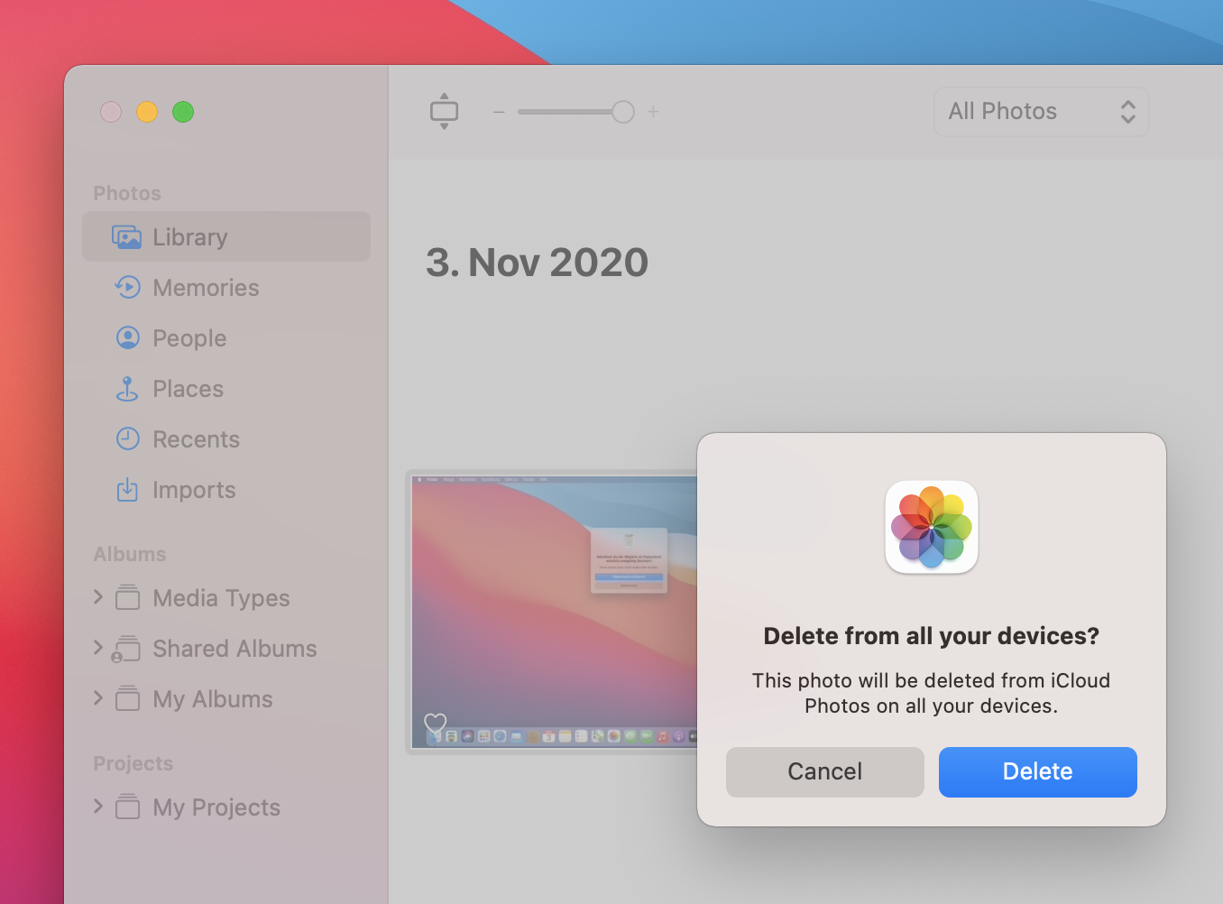
An app can now specify an app-specific accent color, which is used for buttons, selections, and in sidebars. Selections have a new, rounded look, and many controls have been redesigned. Sheets have also been redesigned, now looking like modal popups, instead of folding down from the bottom edge of the toolbar.
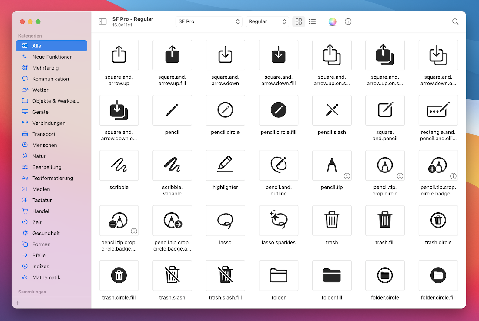
SF Symbols, a library of icons made by Apple previously available in iOS, is now included and used in macOS. These icons can be used in toolbars, sidebars and elsewhere.
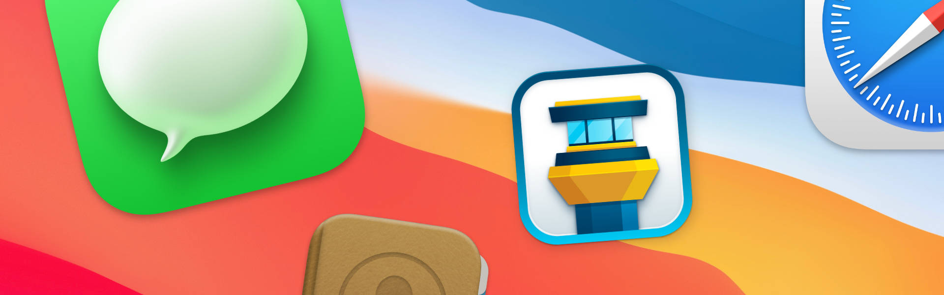
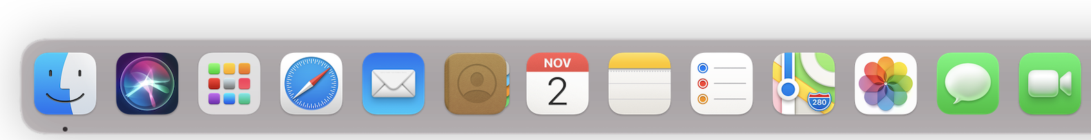
App icons get a new style as well, with all icons now using a rounded rectangle shape. While the icons have been updated to correspond more closely to their iOS counterparts, they do retain some macOS touches. Traditionally, app icons in macOS have featured a more realistic style than in iOS, and many Big Sur icons sport quite a bit of detail.
There are many more changes in macOS Big Sur than covered here. The dock is redesigned, as is the notification center, and there is a new control center (another change brought over from iOS). Menus look different, there are new system sounds, and more. In fact, along with the news of the impending switch to Apple Silicon — Apple-made processors — for Mac hardware, these changes were enough for Apple to decide to turn up the version number for macOS Big Sur to 11! Catalina, the current version of macOS, has the version number 10.15, while macOS Big Sur is known as version 11.0.
Changes in Tower
If you ask us, part of what makes Tower great is the fact that it’s a native Mac app. Not only does this provide the best performance, but also the best integration with the operating system — the environment in which the app is used. As macOS users generally update quickly, it’s important that Tower adapts the design language of the latest macOS version. Of course, this can’t mean that Tower suddenly looks out-of-place on previous versions — while some changes can apply both to old and new macOS versions, some user interface changes should be restricted to users running the latest update. We’ve been hard at work updating Tower to take advantage of what macOS has to offer, and we think the result is a Git client that looks and feels better than ever!
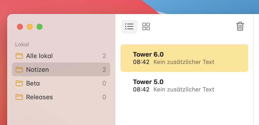
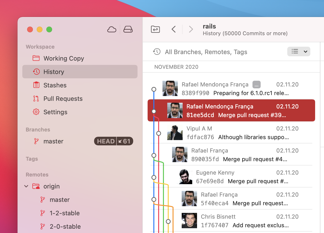
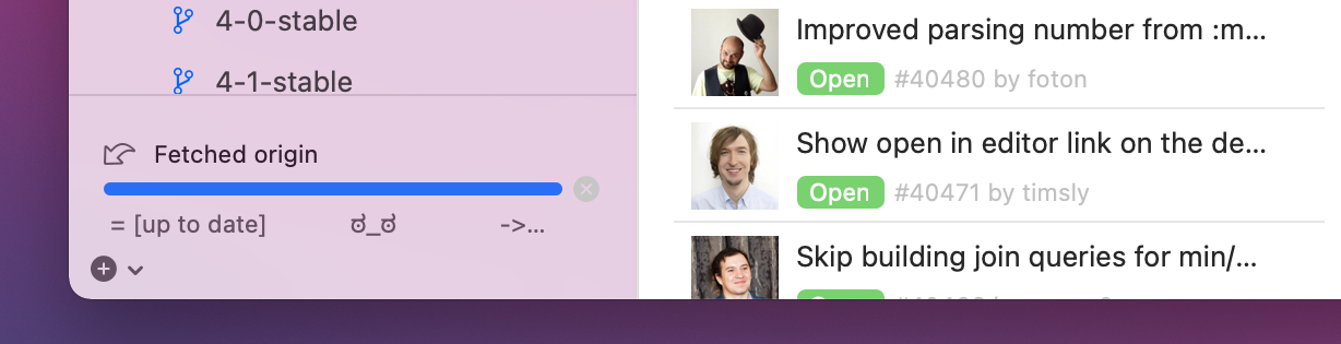
At first glance, you’ll notice that Tower adapts the full-height sidebar look of macOS Big Sur. This change doesn’t only affect the sidebar: it has consequences for the toolbar, the window title and the navigation bar. The buttons in the toolbar, pushed to the right, now share space with the window title and with elements from the navigation bar, like the clone button. The navigation bar itself has been removed, for a cleaner look. The services and bookmarks icons, previously in the navigation bar, now show up in the main toolbar, at the top of the new full-height sidebar.
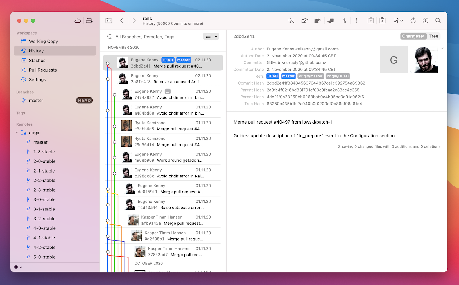
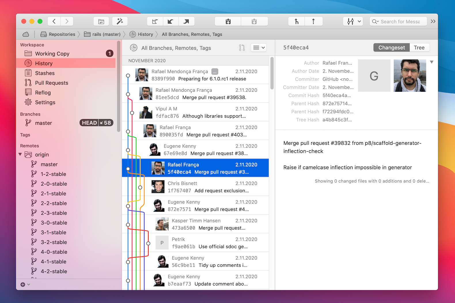
Big Sur comes with a new look for selections, with rounded corners and different spacing. Naturally, Tower adopts these, except for in some places where rounded selections wouldn't make visual sense.
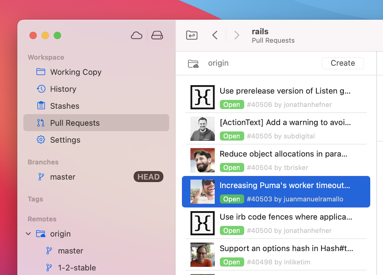
Icons have been updated: we now use SF symbols along with some custom ones in the sidebar, the toolbar and in the quick actions popup. These icons have a lighter look than the ones previously used. In addition, the sidebar icons and selections now use the system accent color, so if you go into your macOS preferences and change the accent color, you’ll see your choice reflected in Tower’s sidebar.
A change which shows up on older macOS versions as well concerns the remote activity area. This area, showing ongoing pushes and fetches, for example, used to be visible all the time. Now, it only shows up when there are actual remote activities going on, otherwise, it stays out of the way.
Finally, our app icon now adapts the rounded-rectangle shape of other Big Sur apps.
Of course, this is just an overview. There are a lot of changes beyond the main ones described here. Positioning and spacing has been adjusted throughout the app, as have the colors of graph lines, badges and file statuses. The preferences window has been rewritten in order to facilitate easier updates and changes in the future. Tower has been recompiled and optimized for running on Apple Silicon. All in all, we are very happy with how Tower Big Sur turned out — we think this is the best-looking, most usable version of Tower yet!
If you already have a Tower account, simply update Tower to the latest version to enjoy its brand-new Big Sur design! The new version is rolled out incrementally to our users using the updater in Tower — if you're in a hurry, you can download the latest version through our website.
Not a Tower user yet? Download our 30-day free trial and experience a better way to work with Git!