We recently updated Tower to make it feel even more at home on Mac OS X Yosemite. We touched many areas of the app over the course of several updates. Now, we want to share our experience from bringing an app to Mac OS X 10.10.
OS X Yosemite UI Design
When we had our first look at Yosemite back in 2014 it became clear to us that Tower would have to undergo a general visual update. Mac OS X Yosemite is publicly available since October 16, 2014, and has been well received generally. By now, more than 80% of all Tower users are running on Yosemite - which underlines the necessity of adapting Tower as much as possible to the latest OS X release.
Yosemite Core Design Changes
Before one starts to redesign a Mac OS X app for Yosemite it's important to get into the new design paradigms introduced by Apple. Over the last couple of years Apple made three major UI releases: Mac OS Panther, Leopard and Lion. Yosemite yet marks another shift in paradigms.
Apple now emphasizes Simplicity, Consistency and Depth to give users a content-focused experience.
New System Font

For the first time since OS X was released Apple changed the System font from a slightly ornamental Lucida Grande to a simpler and rather geometric Helvetica Neue with less variation and ornamentation. There have been lots of articles and discussions about whether changing the system font to Helvetica Neue was a good idea. Especially in smaller sizes on non-retina displays Helvetica Neue has its weaknesses.
Despite its grand reputation, Helvetica can’t do everything. It works well in big sizes, but it can be really weak in small sizes. Tobias Frerer-Jones
However you might feel about Helvetica Neue, changing the system font at least emphasizes how serious Apple is about becoming "simpler" and more consistent across its own platforms and inside the system itself. Helvetica Neue already sneaked in before Yosemite in apps like Notes, iTunes, and iPhoto, so using it as the new default system font is only consequent.
Simplified and Consistent App Icons
Another major step towards simplicity and consistency is taken by simplifying and systemizing App Icon Styles. Over the past years, app icons diverged and started to look very different and inconsistent. Yosemite introduces two basic icon styles along with a couple of guiding principles:
Realistic Icons are used by Preview, Mail, Photo Booth and others. The new realistic icon look is simplified and features the same light sources, perspective, and rendering.
Additionally, a consistent angle of 9° is used when depicting tilted app icons like Contacts or Calendar. Why the tilted angle you might ask? Apple is using the icon tilt for quite a while now to make app icons easier distinguishable from documents or folders.
Graphical icons live inside a round shape and feature a strong icon with a consistent emboss effect. Picking the right icon style for your app depends on what represents your app best.
Think of your app icon as your calling card, and spend the resources necessary to ensure that it makes the right impression on users. Apple Human Interface Design Guidelines
Does depicting a real-world object help users understand the virtual version? Does the addition of realism enhance both understanding and usability? Feel free to modify a real-world depiction if it helps to enhance the user's understanding. Apple encourages you to take out everything that isn't necessary and only adds visual clutter.
Translucent and Vibrant UI elements
Depth as a design principle is achieved with the new translucency and vibrancy features, together with subtle gradients and shadows as already used before across the app interface.

Translucency can be used in the app's sidebar, toolbar and overlays. The effect doesn't only make the background shine through in a transparent and blurred way, it also modifies the colors underneath to make them appear less muddy.
Vibrancy goes hand in hand with translucency. It affects UI elements on translucent backgrounds by absorbing color from content that’s underneath.
Brighter and Flatter UI Elements

All UI elements have been updated to match the general brighter and flatter design direction. The same applies to window chrome which now features a brighter and less intense color gradient.
Bringing Tower to Yosemite
A major priority of Tower has always been a native and integrated feel on Mac OS X. We do so by following Apple's recommendations about UX/UI patterns and technical implementations. A positive side effect of this approach is the capability of delivering relatively fast updates when new system versions are released.
Join Over 100,000 Developers & Designers
Be the first to know about new content from the Tower blog as well as giveaways and freebies via email.
App Icon
We changed Tower's app icon quite a bit to achieve a simplified, yet realistic look over the course of multiple iterations.
All details that do not contribute to a better understanding of the app icon are gone. We now also use a light setup which resembles the one Apple is using for its new icons — Light blue and orange light sources were added from opposing sides. The perspective is adjusted to make the icon look more consistent next to the other ("realistic") icons in the dock.
Redesigning the window area was hard. After coming up with different versions of the inner life behind the glass we decided to get rid of everything inside the Tower icon since it only led to visual clutter without contributing to a better understanding of the app icon. Especially in smaller sizes like in the dock where users will see the app icon most of the time, superfluous details (like a crew behind the glass) only led to fuzziness.
The initial Tower 2 Yosemite app icon release had a comic glass material look which wasn't in line with the rather realistic look of the app icon. The latest Tower app icon window area is more consistent with the general app icon look and features additional translucency to let the background shine through. This does not only play nicely with the translucency feature of OS X Yosemite, it also allows the app icon to adapt to the general color mood of the user's system depending on the Desktop background or current context of the icon.
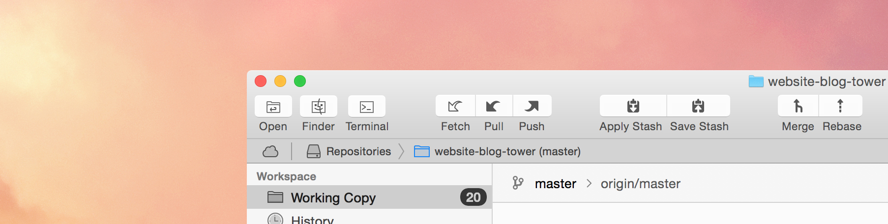
Toolbar & Navigation-Bar


The Tower toolbar contains default UI Elements, so the basic design is dictated by system defaults. We adapted the new button look and made a few changes to the "secondary" button icons.
Since we are following Apple's recommendation and use template images for UI artwork since Tower 2.0, updating the toolbar was relatively easy. Template images only provide the shape of an image as a vector-based format (PDF).
A template image is a streamlined, monochromatic image that can acquire different visual effects, such as selection highlighting and vibrancy. […] You want to make your template image as solid as possible (that is, with very little transparency or alpha values) so that it will look good when the system applies effects, such as the inactive appearance. Apple Human Interface Design Guidelines

While core actions such as pulling from or pushing to a remote repository or applying and saving stashes feature a more solid appearance, secondary icons such as showing a selected file in the finder or toggling the quick open window are made up of strokes.
The new navigation bar icons abandon the embossed visual style (Mavericks) and feature a lighter look instead — emphasizing outlines like predominant in the sidebar. Since space in this area is rather tight, buttons don't work in the area since adding them would also mean losing additional space to the button shape and necessary margins. Additionally, buttons also don't make much sense from a general UI perspective for the breadcrumb-style navigation bar items.
Sidebar

All sidebar icons are refreshed and reflect the updated Yosemite sidebar icon style.
The updated icons show clearer and more dominant outlines while relying on more subtle fill colors. Additionally, the icons were slightly simplified by removing unnecessary details.
Since we rely on additional "visual effects" which are applied by AppKit, the blue color toning of the sidebar icons as seen on OS X Mavericks is gone. Sidebar icons now feature a translucent black & transparent look.
Colors

Overall, OS X 10.10 features a brighter color palette and less intense gradients. This change is visible in general UI elements and their use of lighter gray tones, but becomes even more apparent when looking at colored UI elements such as label colors, the new default folder icon color, freestanding toolbar icons or the default color for highlighted elements.
We've updated the colors towards a brighter scheme and took the update as an opportunity to make the scheme more consistent as well.
In order to keep track of various color values (and UI styles, too) we implemented our own, configurable global view defaults in Tower. By having a centralized approach towards managing the visual appearance of UI elements and graphics, updating and maintaining styles has become simpler. Additionally, it's also easier now to keep things consistent. The designer can jump into the appropriate files inside Xcode, quickly adjust and tweak UI styles and colors and compile Tower to see how the changes work out.
Button Styles


Before Yosemite, button styles provided by the system were rather limited, so we felt forced to create custom buttons. Over time, buttons used across different areas of the Tower UI diverged which lead to inconsistencies.
The latest AppKit offers a set of button styles which are better adapted to different scenarios. We got rid of custom button styles in favor of default system buttons with minor adjustments throughout the entire UI. We also make use of default sizes provided by the system. By doing so, all buttons now have a more consistent look and feel closer to the system.
Empty States and Progress States
Empty views, multiple selection views and progress views were overhauled. We took the same basic approach as we did for the sidebar icons, resulting in brighter (and lighter) fill colors while slightly emphasizing icon outlines.
Preferences Icons


All preferences icons were updated according to our new overall aesthetics: Brighter colors and less unimportant details which don't lead to a better understanding. We also changed our approach towards retina icons quite a bit. Until now, the retina versions of our preferences icons were simply doubled in size which also resulted in thicker outlines and details. The new icons maintain thin outline strokes which gives them a lighter and more "elegant" feel on retina displays.
A word on App Compatibility
The new OS X UI brings quite a few changes to the look and feel of an app. Although the adaption rate of Yosemite is high and older OS X versions are on the decline, one still needs to consider the app appearance on older system versions.
New features like translucency and their support can simply be detected by making runtime checks about the system version but other visual updates need to be treated with more care. Especially button styles can feel out of place and need to be treated in a system-specific way.
The same basic principle applies to artwork: Some icons depend on the system look and thereby may look out of place on older systems. For example, in Tower we use a couple of icons which incorporate the system folder icon in one or another way. Since Yosemite uses a very different folder icon we make sure that icons which contain a folder preserve the old look on older systems.
In some cases it can become tricky to decide whether to treat certain aesthetics system-specifically or just go for a "yosemitized" look on all system. Targeting specific OS versions might bloat the app and will make managing your app's aesthetics harder, so you need to draw a line and compromise at some point.
When in doubt, here's what Apple says:
Make it awesome on Yosemite, take advantage of new UI experience and stick with the system. Where possible, stick with standard controls, system colors, template images and system fonts. Freshen the UI, and when in doubt, favor the new visual style.
Conclusion
We hope that this article gave you a nice overview about the aesthetic changes Yosemite brings along and what this might imply for your app. While we are talking specifically about Tower, we do think that the philosophy behind the changes we covered are applicable to most applications that are transitioning to an adapted UI style for OS X Yosemite.
As a by-product of Tower's Yosemite update, we've created a little Yosemitization Checklist. It contains tips about what to keep in mind when designing an application for Mac OS 10.10.
Join Over 100,000 Developers & Designers
Be the first to know about new content from the Tower blog as well as giveaways and freebies via email.