
Working with Images
How Images Impact Performance
On average, images make up more than 60% of a web page's weight.

Contributing the most bytes to be downloaded, images are often the biggest brake block for a site's loading time. On the other hand, however, this also makes images a huge potential for optimization.
In this chapter, we'll look at the right ways to deal with images in order to make our site faster.
Getting Rid of Images
Every image that you include on your page comes with a significant performance cost: it has to be downloaded to the user's computer. Therefore, the best image you can use is really no image at all!
Eliminating an image is often possible if you think about the effect you want to achieve instead of the image resource you think you need.
CSS
Since it is now available in all modern browsers, CSS3 has totally changed the game: many things that required the use of images can now easily be done with just a couple of lines of CSS.
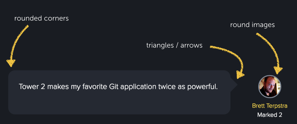
Think of shadows, rounded corners, gradients, transparencies, speech bubbles, and even animations - and suddenly, a lot becomes possible without images.
Web Fonts
Rendering text inside an image is most often a bad idea: the image uses unnecessary bandwidth, the text cannot be selected or searched for, and it won't adapt to different screen sizes and pixel densities as nicely as "real" text will do.
All of this can be avoided by using web fonts. You're able to access an endless selection of custom fonts in your designs while sacrificing neither performance nor semantics.
In a Nutshell
Getting Rid of Images
Use your browser's developer tools to get a list of all the images on your web page:
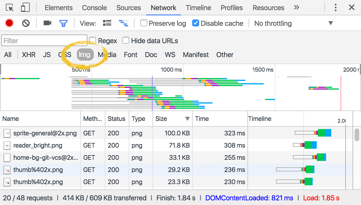
Now, take a thorough look at each image:
- Do you really need it?
- Can you replace it using either CSS or web fonts?
Selecting the Right Image Format
Once you know that you really need a certain image (when you cannot replace it using CSS or web fonts), it's time to find the best format for it. Unfortunately, there is no "one fits all" solution when it comes to image formats: you have to carefully look at each image and find what works best for this very item.
1. Does the image consist of geometric shapes?
When your image scene is made up of lines, circles and other paths, the SVG format might be the ideal choice. Since it's a vector format, it describes an image using geometric shapes. This often makes things like icons and logos the perfect candidates for SVGs.
When the characteristics of an image are fit for SVG, it doesn't only result in a small file size: SVGs can be scaled without losing quality, making them completely independent of screen resolution and pixel density.
2. Is the image a photo or screenshot?
When an image contains many details and irregularities (like a photograph typically does), the JPEG format is probably the right choice. Although JPEG compresses files using a lossy algorithm, a combination of many colors and many details in an image often makes it the only viable option.
Play a little bit with the quality settings when saving a JPEG and you'll often find a good compromise between file size and quality.
3. Do you need transparency and/or maximum quality?
When you need transparency in your image, the JPEG format can be ruled out quickly. Instead, you will most likely go with the PNG format in such cases. An additional benefit of PNG is that it only uses losless compression algorithms. This means that it's ideal when you need maximum quality for an image and cannot accept losing any fine details.
On the other hand, all of these advantages (of course) come with a price: PNG produces rather big file sizes and should therefore only be used when the other options don't work.
Finally, keep in mind that PNG comes in two flavors: use PNG-8 when you get by with a smaller color palette (\<=256 colors) and only resort to PNG-24 when a large number of colors in your image demands for it.
A Special Case: Animation
Today, a couple of different methods can be used to incorporate animation into your images:
- The GIF image format is a very common and established way. Many tools exist to help you create animated GIFs, while browser support is excellent.
- The SVG format also offers animation capabilities - although probably more laborious to create and not as well supported in current browsers as GIF.
- With CSS3 in mind, a lot of things are possible when it comes to animation. Although possibilities are definitely limited, CSS3 can make for a very efficient animation alternative.
Of course, many other methods exist beyond the ones listed here. Exploring them would go far beyond the scope of this guide and its focus: from a performance optimization standpoint, GIF, SVG and CSS3 are probably the most efficient ways to realize animation.
In a Nutshell
Choosing the Right Image Format
When looking at the images on your web pages, ask yourself at least the following two questions:
- Can I convert some of my images (like logos, icons, diagrams, drawings, text, etc.) into the SVG vector format?
- Am I using the best format (PNG or JPEG) for each of my raster images?
Optimizing Images
Delivering the "optimal" image involves many tasks and is different for every file format. To save you from knowing and remembering all the details, you should use specialized tools and automate as much as possible.
Keep in mind that some optimization techniques come at a price: lossy optimization reduces the file size, but also the image's visual quality. You'll have to decide for yourself on what's acceptable. Other techniques are completely harmless: lossless optimization, for example, removes metadata (like information about the used camera or geography) and other non-destructive algorithms.
But before you even think about optimizing your images, make sure it’s high quality. You can use tools like BeFunky to edit your photos conveniently online. In a couple of minutes, you’ll have a brand-focused graphic you’re just dying to share.
Optimization Techniques
Here's an overview of the most common possibilities when it comes to image optimization:
- Your first step should be to choose the best file format for each of your images.
- If you choose a lossy format like JPEG, it makes sense to play a bit with your image editor's "quality" setting when saving the file. You must decide how much visual quality you are willing to lose (in the form of blurs, artifacts, etc.) in order to arrive at a smaller file size.
The JPEG format also offers a "progressive" mode. While this doesn't reduce file size, it improves perceived performance for your visitors because the browser can start displaying it sooner. - If you choose a format like PNG or GIF, you might want to reduce the number of colors in the image. Scaling down to a smaller color palette can shrink the file size significantly - if you're willing to accept the visual impact.
- If you choose the SVG format, make sure it gets run through a tool like SVGO. You might save quite some bytes by minifying the content and removing unnecessary metadata (like comments and layer information).
- If you choose a raster format (like GIF, PNG, JPEG), additional optimization often makes sense. Although Photoshop and other image editors do their best to keep file sizes small, specialized tools can often squeeze out another handful of bytes (or kilobytes).
Optimization Tools
In the last couple of years, a lot of image optimization tools have emerged. We've compiled a list of some popular ones to get you started:
Automation / Command Line
- Minification plugins for Grunt (grunt-contrib-imagemin) and Gulp (gulp-imagemin)
- optipng
- pngcrush
- gifsicle
Online Tools
- SVGO (SVG)
- TinyPNG (PNG - JPEG)
- Kraken.io (PNG - JPEG - GIF)
- Compressor.io (PNG - JPEG - GIF - SVG)
- ImageOptim (JPEG - GIF - PNG)
Desktop Tools
- JPEGmini for Mac and Windows (JPEG)
- ImageOptim for Mac (JPEG - GIF - PNG)
- Trimage for Linux (JPEG - PNG)
- Squash for Mac (JPEG - PNG)
In a Nutshell
Optimizing Images
Delivering the "optimal" image doesn't stop at choosing the right file format:
- Keep the optimization possibilities for each of the major file formats in mind.
- After saving an image in your favorite image editor, use an optimization tool.
- Automate as much of the optimization process as possible.
Loading the Right Images
In today's web, a plethora of different devices challenges us: different screen sizes and pixel densities make it a demanding job to serve a page that looks good on any device. And, of course, this rubs off on how we have to deal with images.
For a modern website, you will most likely want to provide separate images for both normal and high DPI screens. And chances are you'll even want to provide separate images for larger and smaller screen sizes.
But the story doesn't end with just creating this variety of alternate images. We also need to make sure we handle them cleverly. If we don't, it might be that we download a huge, high DPI image asset on a device that can't even display all those pixels - resulting in a lot of wasted bandwith and slow loading times.
Loading Only the Images That You Need
The rule of thumb is that you should only load the right image for the present situation.
In some cases, this rule is very easy to follow: e.g. if you have an image gallery on your website, you should create separate images for those small thumbnail previews and the big originals.
But you might be tempted to go with the "lazy" alternative: why not just always serve the big originals and simply include them with smaller "width" and "height" attributes? Although this would save you from creating separate images, it would also mean that you would waste a huge amount of bandwith: in order to show the overview page, the client must download a huge amount of large images - even if only small thumbnail images are actually displayed. The visitor will have to wait forever until she sees the overview...
Using Responsive Images
Situations like our little image gallery are rather easy to handle. The responsive web, with its many screen resolutions and sizes makes it a little harder to always deliver the right image. However, of course, solutions have already emerged.
The "srcset" Attribute
Most modern browsers now support the "srcset" attribute on the "img" element. It allows you to define multiple sizes of an image asset in a single ´img´ tag - along with conditions when each one should be used.
Let's look at a very simple example:
<img  src="learn-mascot.png"
      srcset="learn-mascot.png 1x,
              learn-mascot@2x.png 2x">
Here, we provide two different image files in the ´srcset´ attribute (separated with a comma). Along with the file names, we also determine the conditions: the first one shall be used on 1x screens and the second one on 2x (high DPI) screens. The browser will then decide by itself which asset to use, depending on the device's pixel density.
If you spare no effort and want to provide an image in even more sizes, ´srcset´ is ready:
<img src="learn-mascot.png"
     srcset="
       learn-mascot@0.5.png 300w,
       learn-mascot.png 600w,
       learn-mascot@2.png 1200w,
       learn-mascot@3.png 1800w"
    sizes="
      (max-width: 20em) 30vw,
      (max-width: 30em) 60vw,
      (max-width: 40em) 90vw">
In the above example, we've provided four different image files to better accomodate different scenarios. Therefore, instead of adding "1x" or "2x" behind the file names, we added the corresponding image's size.
In addition to this actual size, we should also let the browser know about the image's layout size - the space it will occupy on the screen. That's what the ´sizes´ attribute is for: we can specify different display sizes for the image, for example depending on the screen width. Simple media queries, well-known in responsive webdesign since long, can be used for these declarations.
Two reasons make ´srcset´ a joy to work with:
- Note that we do not tell the browser which file it should actually use in which case. The browser will select the "right" file depending on the exact scenario on its own. We only provided it with some alternate files and the screen size the image will occupy.
- Also note that we don't have to worry our brains about backwards compatibility: if the browser does not support the srcset attribute, it will simply use the file defined in good ol' src as a fallback.
The "picture" Element
With the ´scrset´ attribute, as already mentioned, the browser chooses on its own which image file it shows. If you want to take over and control this yourself, then the ´picture´ element is for you. It instructs the browser to use different image files depending on self-defined conditions. This allows you to use a different image in different scenarios. E.g. a wide panoramic image for large screens and a completely different one on a small screen (maybe a cropped version focusing on just a detail of the big picture). This is sometimes referred to as "art direction".

<picture>
  <source media="(min-width: 900px)" srcset="mascot.png 1x, mascot@2x.png 2x">
  <source media="(min-width: 400px)" srcset="mascot_small.png 1x, mascot_small@2x.png 2x">
  <img src="mascot_medium.png" srcset="mascot_large.png 2x" id="mascot-image">
</picture>
As you can see, ´picture´ is just a container for multiple ´source´ elements and a single ´image´ tag. You can use the ´source´ elements to suggest different alternatives of your image that should be used under certain conditions - which are simple media queries. The browser then uses the first source image that offers a matching media condition.
Note that a source element can also have a ´srcset´ attribute; this allows us to deliver the right image for the device's pixel density, just as explained above.
The ´img´ tag serves as a fallback for browsers that don't support the ´picture´ element. It is also the target of any CSS stylings that you want to apply. (I.e. you shouldn't target the ´picture´ element in your CSS.)
A Word on Browser Support
As of today, the srcset attribute is implemented in almost all of the current browsers. Depending on your target group, the picture element might be unsupported in some cases. Given how valuable these technologies are, however, it's great that we're able to use them already today by including the Picturefill polyfill library.
Further Reading
Although often rather easy, delivering responsive images can also become a complex topic. If you want to read more about this topic, check out the following resources:
In a Nutshell
Optimizing Images
An image is only "optimal" in the context of the device and screen it is displayed on.
- Don't load images that are too big for the device's capabilities (in terms of pixel density or screen size).
- Use responsive image techniques like ´srcset´ and ´picture´ to deliver the best available picture in every scenario.
Get our popular Git Cheat Sheet for free!
You'll find the most important commands on the front and helpful best practice tips on the back. Over 100,000 developers have downloaded it to make Git a little bit easier.

About Us
As the makers of Tower, the best Git client for Mac and Windows, we help over 100,000 users in companies like Apple, Google, Amazon, Twitter, and Ebay get the most out of Git.
Just like with Tower, our mission with this platform is to help people become better professionals.
That's why we provide our guides, videos, and cheat sheets (about version control with Git and lots of other topics) for free.